One kit for every format
The logo kit ships in CMYK (AI, EPS, PDF, JPG) and RGB (AI, PDF, PNG, SVG). Print and screen work start from the same files.
Logo kit
Work / Skillspark
Brand systematisation and building a team of specialists for special tasks
Skillspark had a logo and needed one identity that held together in print, on screen and on a conference floor. I refined and systematised the logo, introduced the brandbook as the standard and built the team of specialists that applied it.
01
The starting point, the mandate and the seat I held.
Skillspark is an IT talent and consulting company. Its claim is “Making skills placeless”. The head office is in Warsaw, with a team in Dubai. In November 2022 I asked for the existing assets and received the logo files, the card in use and a sample proposal. The company had a logo but no rule for using it.
The aim was one visual communication: which colours, which type, which logo version, who approves. In January 2023 I sent the company’s leaders brandbook v3 and a proposal for brand management across the company, then agreed the direction with them. The contract followed in March 2023.
The scope covered brand management, UX/UI, presentation templates and other communication materials, social media and advertising, and industry events. I ran it as Head of Design / Brand Lead and built the team of specialists to deliver it.
02
From strategy to the client relationship. For each level: what I decided and what I handed to a specialist.

Five levels from one seat. Each level carries what I decided and what I handed over.
Brand management for the whole company, with one visual communication as the aim. The direction, agreed with the company’s leaders.
Social media and event plans, to the specialists who owned those disciplines.
To keep the company’s logo and refine it. To approve every logo variant. One graphic style across posts, social graphics and presentations.
Drawing and production, to the graphic designer and the presentation designer.
Which disciplines the work needed, who owned each task and the review of every deliverable. The weekly team call.
Day-to-day ownership of each discipline, to the specialist who led it.
The scope, the before and after proof, the monthly summary and the external partners.
Production, to the specialists. Printing and gadget production, to vendors.
What went to the company’s leaders and the rhythm of syncs with the client’s operations owner.
The organiser contact, to the events specialist. The onboarding materials, to the presentation designer.
03
Logo, colour and type as the plates of a logo guide, and what the standard changed for the people using it.
We did not create the logo. We refined it, systematised it and wrote the rules down. I introduced the brandbook as the standard for corporate identity design, and every plate below restates one of its rules.
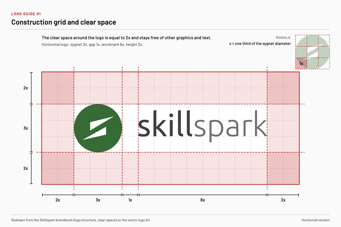
The logo on its construction grid. The 1x module sets every proportion.
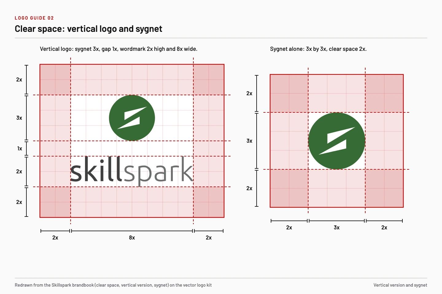
Clear space around the logo equals 2x, here for the vertical logo and the sygnet.
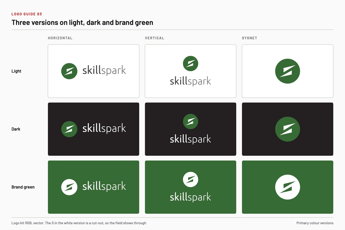
Horizontal, vertical and sygnet on a light, a dark and a brand green field.
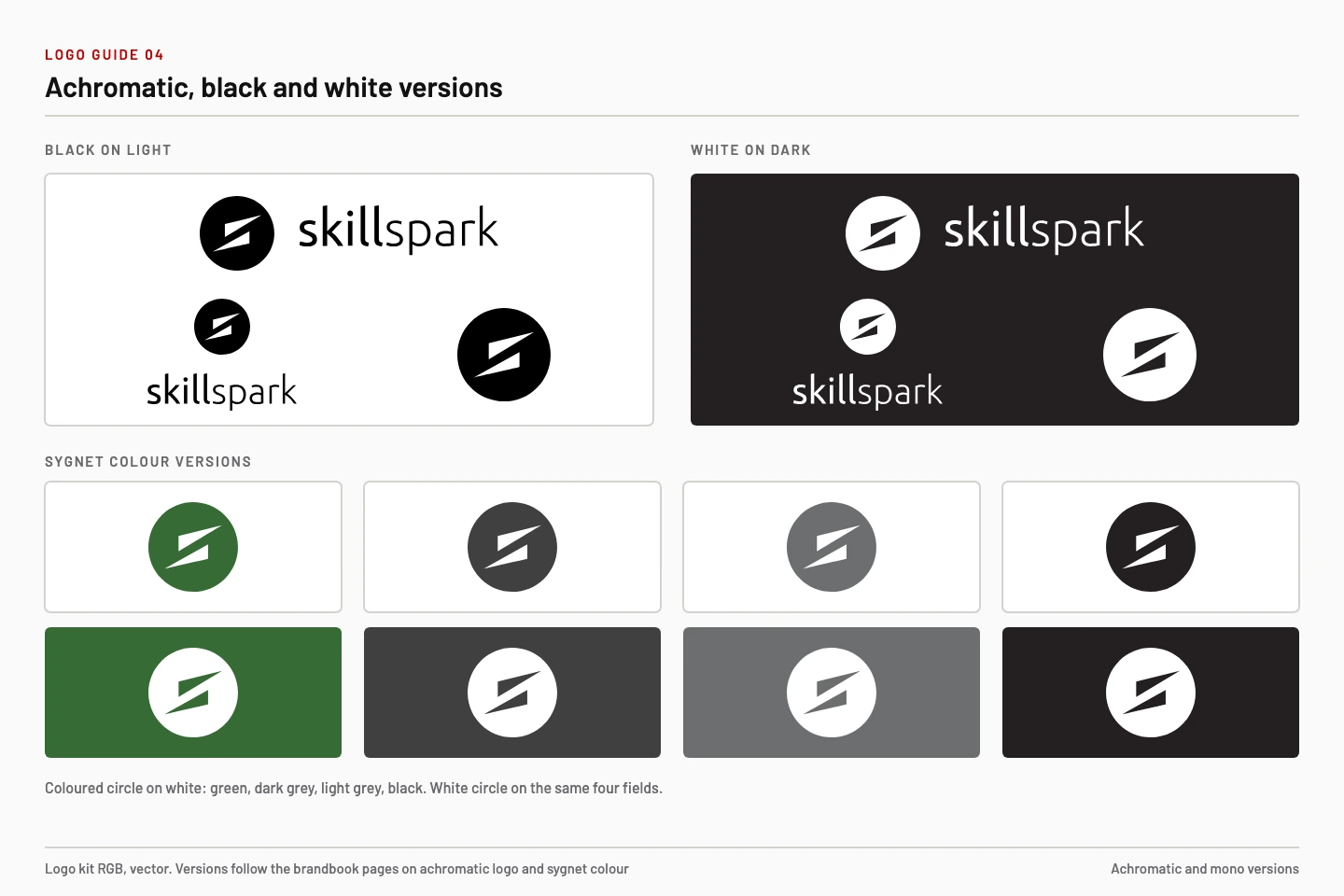
Achromatic and black and white versions, and the sygnet in four colours.
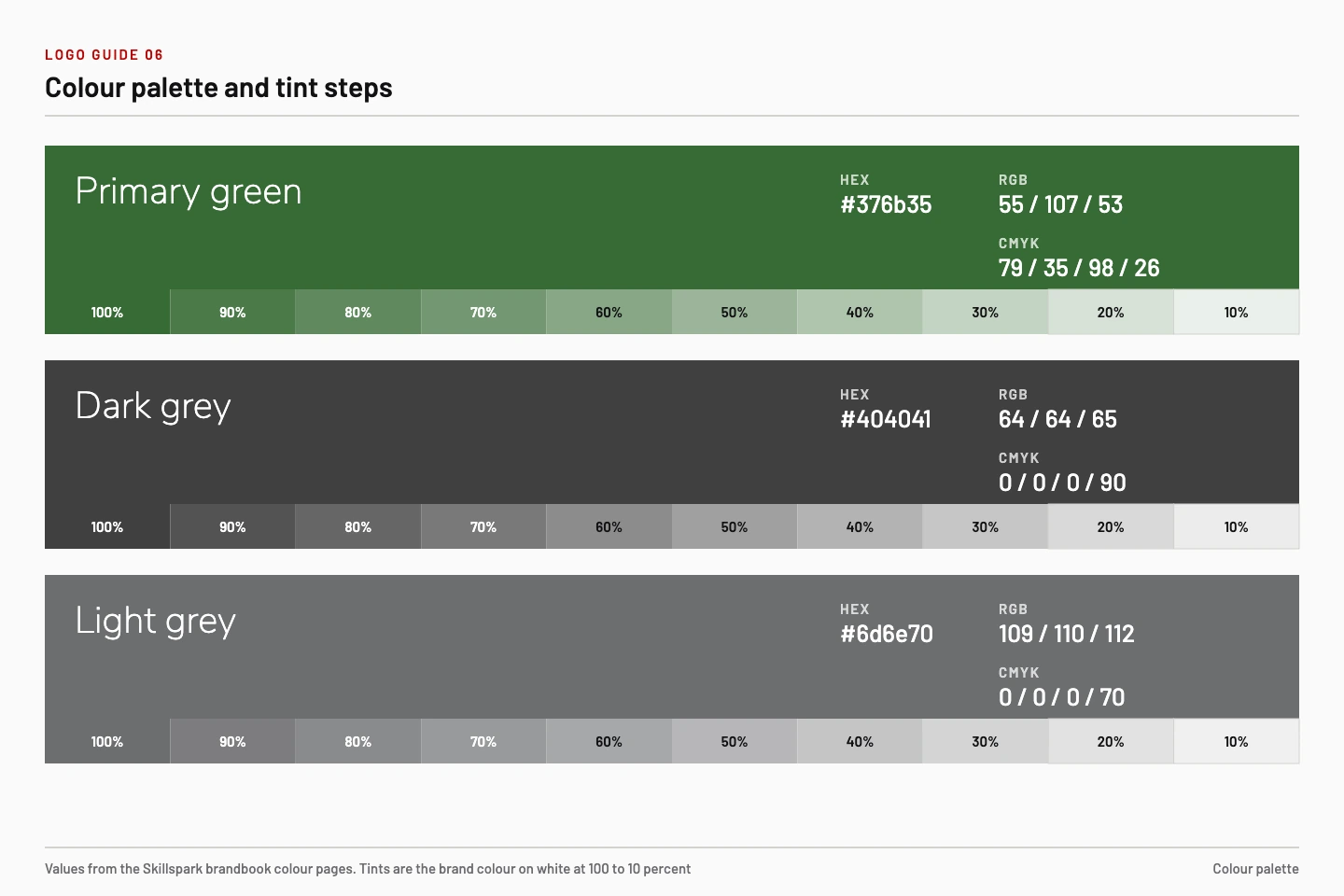
Primary green, dark grey and light grey with values and tint steps from 100 to 10 percent.
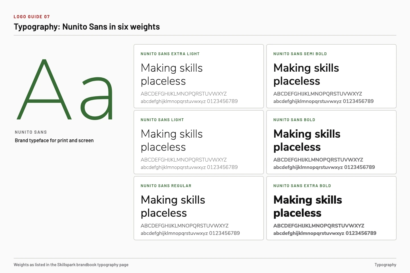
Nunito Sans in six weights, from Extra Light to Extra Bold. The card has an Arabic side.
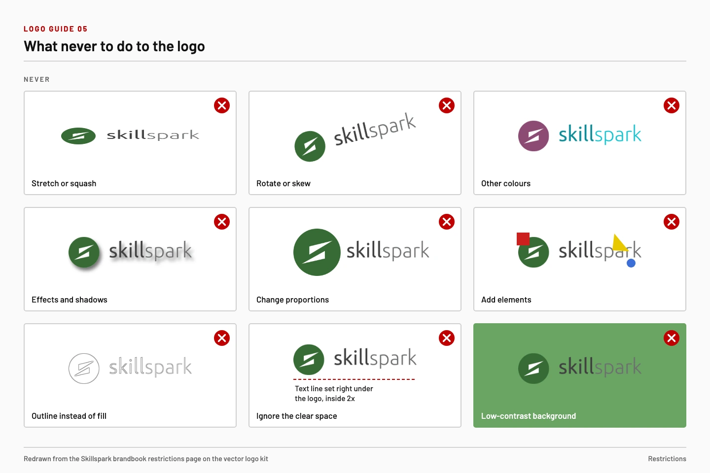
Nine ways the logo is never changed.
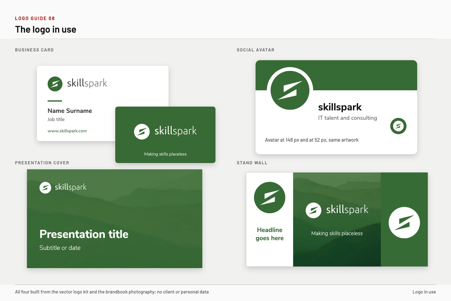
The logo placed by the same rules on a card, a social avatar, a deck cover and a stand wall.

Each layer builds on the previous one, from foundation to channels, and all of them draw on one source of truth.
The logo kit ships in CMYK (AI, EPS, PDF, JPG) and RGB (AI, PDF, PNG, SVG). Print and screen work start from the same files.
Materials with the logo are authorised by the Brand Team. An internal policy adds that the logo is used only for company purposes, unaltered, and that any change needs approval.
I presented brandbook v3 as a base to be expanded with more guides. The logo was updated inside the book again in August 2023, and an external proofreader checked the text.
04
Roles only. My own cell is split into what I kept and what I handed over.

The team by specialisation, with the Head of Design / Brand Lead in the middle and external specialists brought in per job.
Kept
The standard, the approval of logos and brand material, the review of every deliverable, the scope and the relationship with the company’s leaders.
Handed over
Drawing and production, social and event planning, audits, development and printing, each to the specialist who owned that discipline.
Drew the logo pack, the brandbook in all its versions, the icons, the business card template and the event graphics.
Built the style guide, the decks, the onboarding deck and the relocation guide.
Produced the LinkedIn audit and the three audiences and content cycles, then the media plan and the Dubai plan. I set the direction, approved the plan and set the standard for every post.
Handled the organiser contact and the partner package, the event planners and the stand description with its draft budget.
Ran the UX and usability audits of the internal app and the MVP design estimate.
Turned research into MVP requirements and kept the cadence.
Built the signature generator and carried the development work.
A language proofreader, a videographer, and print and gadget vendors, brought in per job.
05
Six rules that kept about a dozen specialists producing one identity.
Every deliverable was reviewed in the task tracker before it went out, and logos and brand material needed my approval.
The team met once a week and each call ended in a summary with one status line per person.
Every month the client received a summary by discipline, next to sync meetings with the operations owner.
I required a comparison of cards, social images, job-ad images, presentations and onboarding materials before and after, to show how visual communication was unified.
The brandbook went to an external language proofreader in August 2023. Two small fixes came back and the corrected files followed in normal and xs size.
An internal policy for employees set how the company image is used: logos only for company purposes, never altered, any change approved.
06
One object each. The call I made and the specialist who did the work.
Business cardthe smallest piece of the brand
The card began as a Latin-only version. In August 2023 the graphic designer drafted it in two versions, with and without Arabic characters, both on the brandbook palette.
My call was to move the watermark from the top right to the bottom right. One UV varnish now works on both versions, and the Arabic text keeps its space.
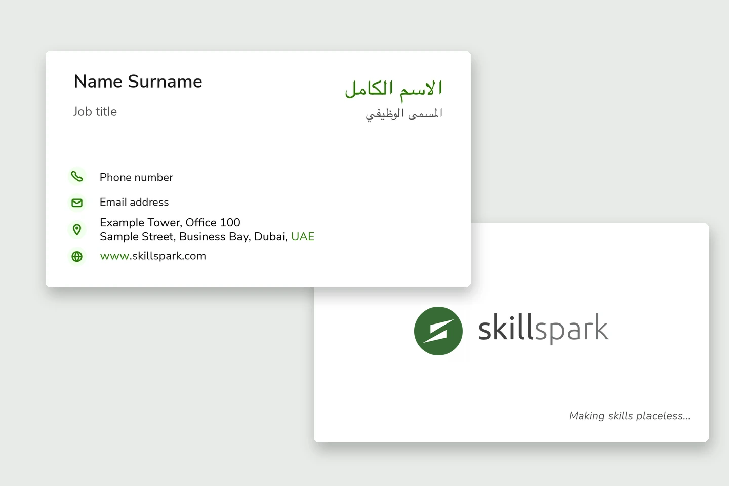
The card front with Latin and Arabic lines, and the back with the logo. Contact lines are placeholders.
Presentationsthe everyday material
The presentation designer built the style guide and the decks that branch from it: internal template, investor and sales deck, marketing deck, vertical guides template and sales pitch deck. A Meet the Brand Team intro completes the family.
I set the rule that decks share the graphic style of posts and social graphics. A new deck starts from the template, so colleagues apply the standard without asking a designer each time.
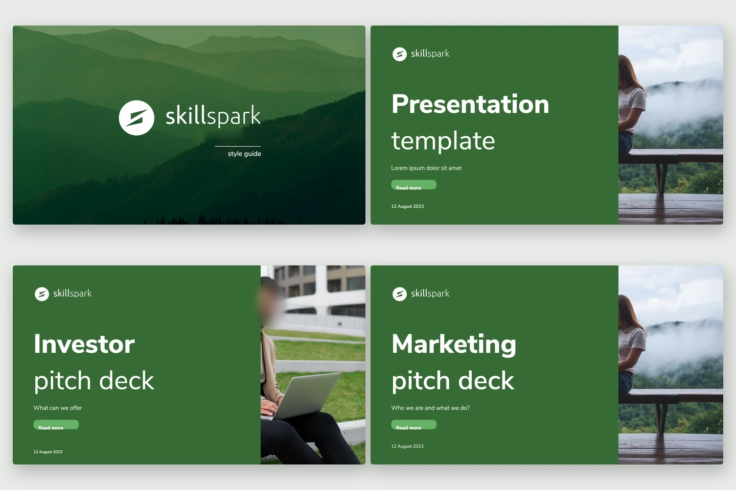
Four deck covers from one style guide: style guide, internal template, investor deck and marketing deck.
Stand and gadgetsthe brand at an event
The HackYeah 2023 platinum package (30 September and 1 October, Krakow) included a 9 m² stand, eight passes, six mentors, a talk and a job board. In August 2023 the events specialist wrote the stand description with a draft budget. The graphic designer produced the graphics for a modular frame with a front roll-up and a tribune counter.
The gadget set covered polo shirts, visitor tees, lanyards, pens, bottles, drawstring bags, 3D stickers and cards. I approved the event graphics.
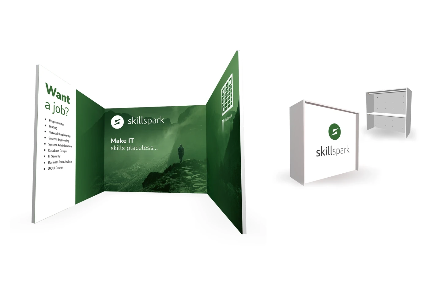
The modular stand wall and the tribune counter, drawn for the HackYeah 2023 partner package.
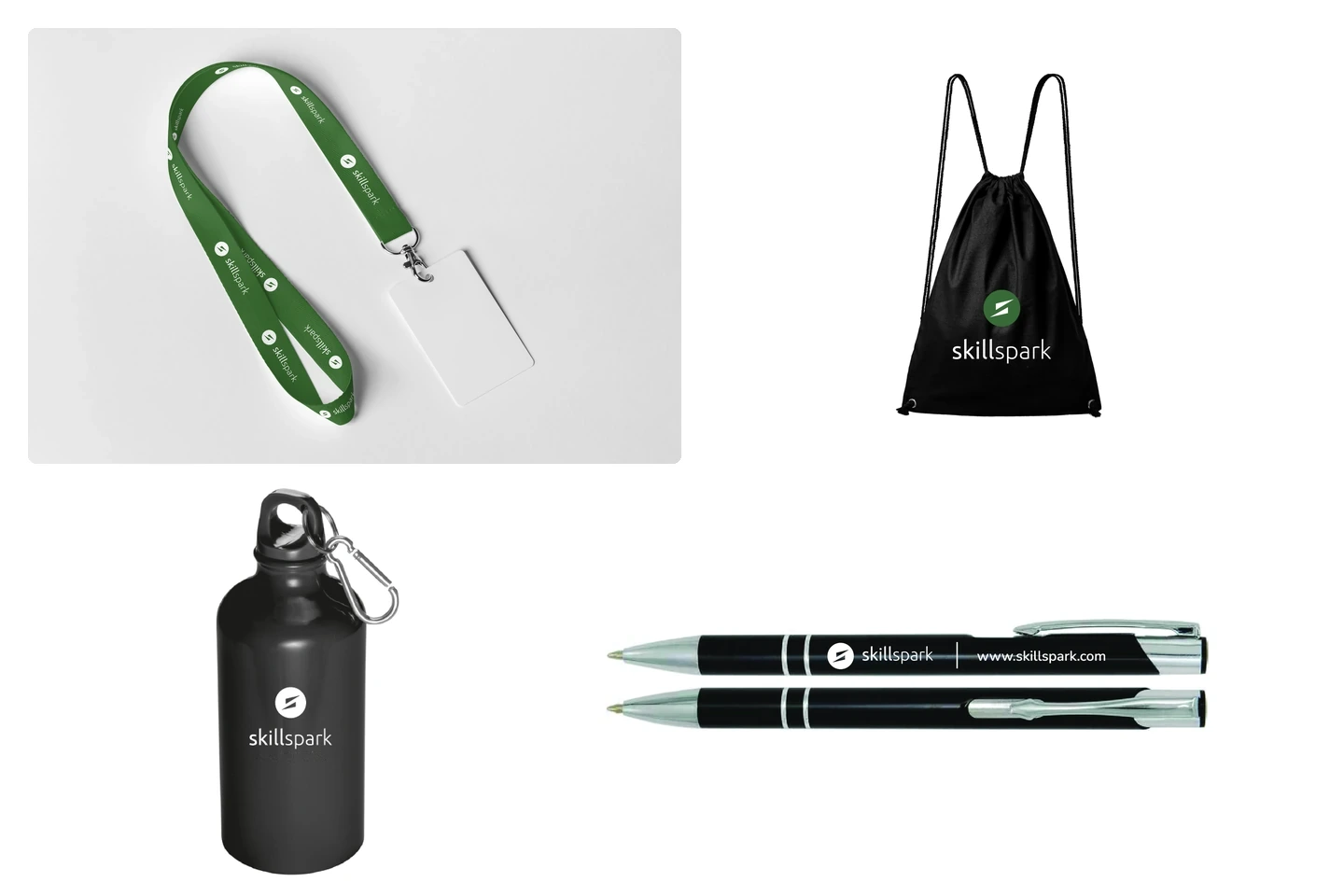
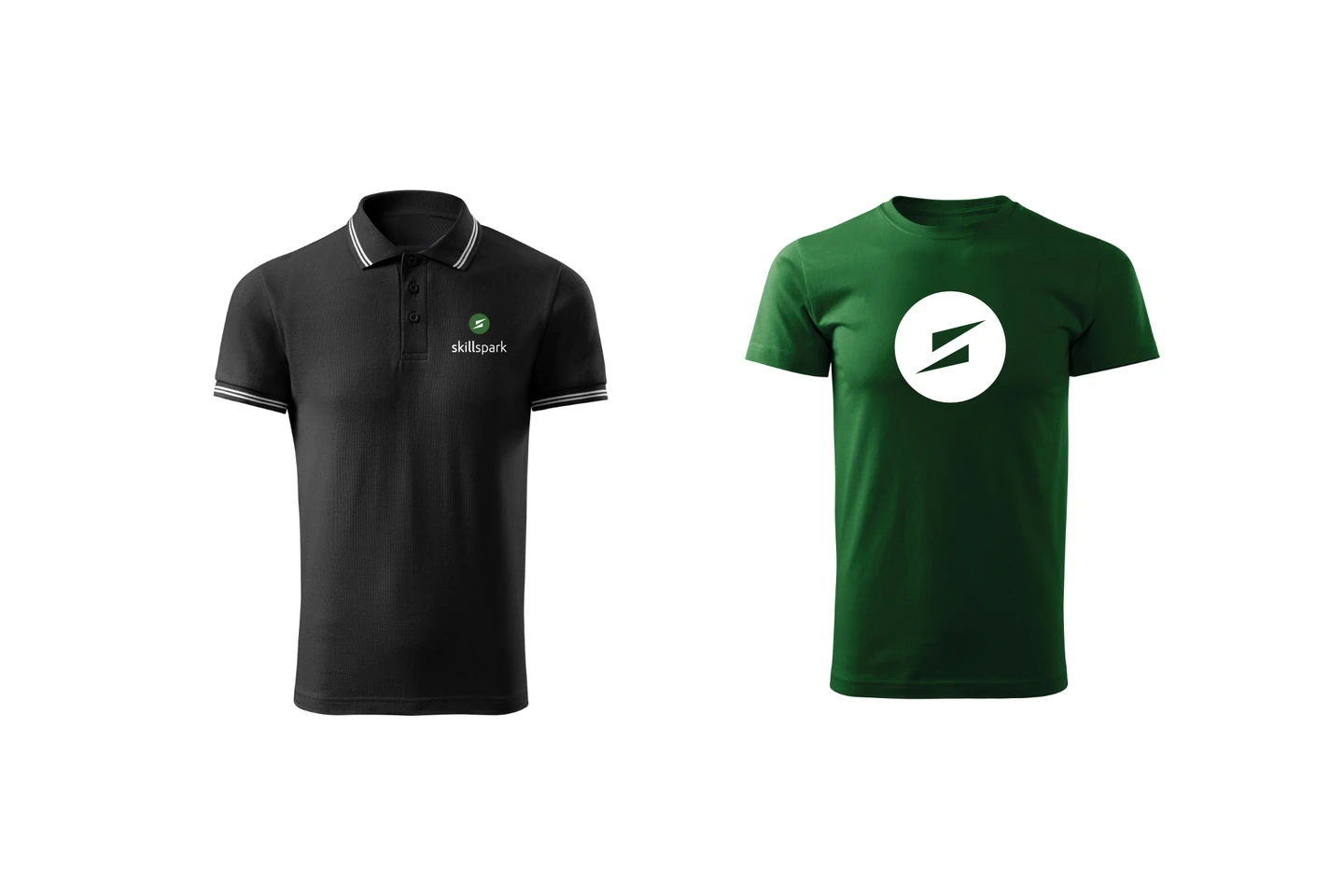
Lanyard, bottle, pen and drawstring bag, and a staff polo and visitor tee, all with the Skillspark logo.
SkillSensethe internal app
SkillSense is an internal app for consultants and managers: work registration, holidays and sick leave. In May 2023 I set its scope: an audit, a component library, screens rebuilt on the library and a redesign. The senior UX and product designers did the work.
The UX audit and a usability audit with issues sorted high, mid and low came in August 2023. In November the remaining MVP design was itemised: pop-ups for work, holidays and sick leave, an Activities view for consultant and manager, and a mobile version.
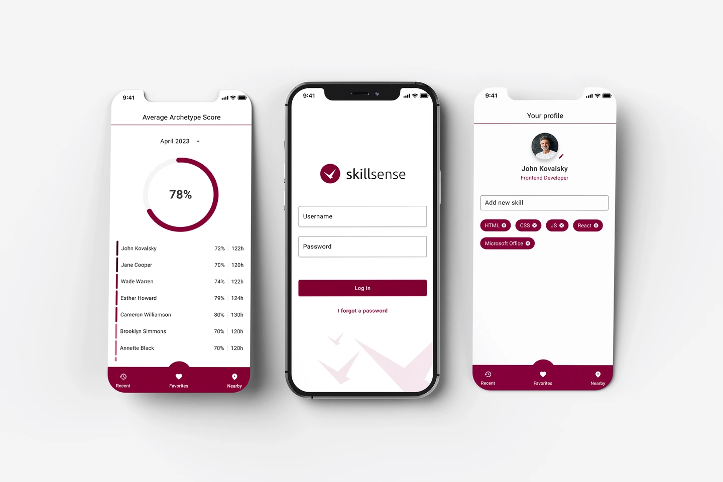
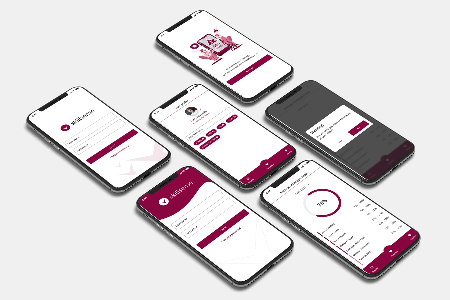
SkillSense version 2 on three phones: score, login and profile, beside version 1 on six phones, before the library rebuild. Placeholder persons from the design kit.
Email signaturesthe identity in every email
The tech lead built a script that produced 24 personalised signature files from a spreadsheet, with Outlook installation instructions. The signature was part of the scope I set in May 2023.
We tested the files in March 2023 and again before the release to the Dubai team in December 2023. Each file carries the brandbook layout with one person’s details.
07
Seven phases in the order I built them. A cadence band at the bottom of the plate applies to every phase.

Seven phases in order, with the cadence band underneath.
In November 2022 I asked for the existing assets and received the logo files, the card in use and a sample proposal. The same day the logo was rebuilt as vectors.
The logo pack was ready on 12 December 2022. Brandbook v3 went to the company’s leaders in January 2023 together with the proposal for brand management. Several versions followed.
From March 2023 the presentation designer built the deck family, the tech lead built the signature generator and an internal policy fixed how the company image is used.
In March 2023 the social media lead set up the LinkedIn target groups with the client and shared a one-month media plan. The audit, three audiences and three content cycles came from the same team.
The HackYeah 2023 partner package included a stand. The events specialist ran planners and a budget planner, and I approved the graphics.
In spring we built an onboarding deck and a relocation guide for consultants moving to the UAE. August brought the Arabic card, November the Dubai social plan, and December the e-cards, signatures and LinkedIn banner.
The internal app got a design library, mockups, a UX audit and a usability audit with prioritised issues. In November 2023 the remaining MVP design was itemised.
“Structure first, creativity second.”
The principle I set for the team
08
Six groups, and the artefact each one holds.
A coherent identity, a standard they can point to and a base they can extend.
Onboarding material for consultants moving to the UAE and graphics for the employer audience.
Pitch, marketing and investor decks on one template, and a post system with a media plan.
A branded email signature for every person, a clear policy on the company image and a card with an Arabic side.
One stand and gadget set, built against the HackYeah 2023 partner package.
An internal app with a scope covering work registration, holidays, sick leave and activity views for both roles.
09
What the brand, the team and the product delivered.
The company had one logo kit, a brandbook it worked from and an approval gate for everything that carried the logo. The standard was written down.
Decks, signatures, event materials and the app design all started from the same rules. The identity ran in print and on screen, in Warsaw and in Dubai.
I set the standard, built the team and kept the review. The specialists did the drawing, the planning, the audits and the build, and the company kept a system it could extend.